
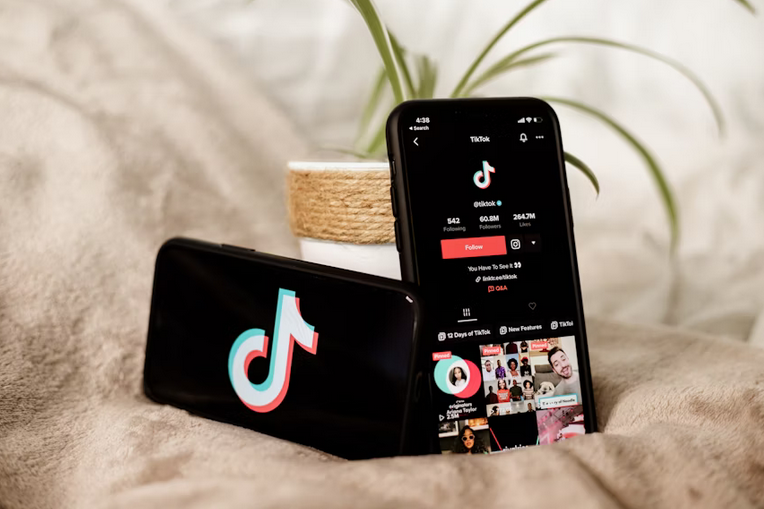
What Developers Can Learn From TikTok’s Seamless UX Design
When you open TikTok, you’re met with an experience that feels almost effortless. No confusing menus, no clunky load times—just a fast, fluid stream of content that seems custom-built for you. That’s not an accident. TikTok’s user experience (UX) is one of the most polished and addictive in the app world today, and developers everywhere should be taking notes.
From its minimalist interface to the smooth transitions and razor-sharp content delivery, TikTok has quietly set a new standard for what seamless UX looks like in mobile apps. Here’s a breakdown of what makes it work so well—and what developers can borrow for their own projects.
The Power of the First Tap

One of the most impressive things about TikTok is how quickly it pulls users into the app. Perhaps, creators are now learning how to buy views on tiktok, and it actually makes sense. From the moment it opens, you’re watching content. There’s no onboarding maze or splash screen that slows things down. That “instant engagement” strategy is a huge reason for TikTok’s stickiness. Developers can learn a lot from this: reduce friction. Whether you’re building a social app, an e-commerce site, or a productivity tool, the quicker a user gets to the core experience, the better. It’s also no surprise that creators looking to boost their reach are learning how to buy views to take advantage of that front-loaded attention. In such a fast-moving interface, visibility is everything.
Swipe-Based Navigation that Just Works
TikTok’s interface is built around the simplest possible interaction: the swipe. It’s intuitive, muscle-memory friendly, and requires zero explanation. Each swipe delivers new content, and the transitions between videos are smooth and lag-free. It makes discovery feel effortless, which is why users can lose hours to the app without realizing it. For developers, this speaks to the value of natural interactions. Swipes, gestures, and seamless transitions reduce cognitive load, allowing users to explore without overthinking. It’s UX that respects attention spans—and that’s powerful.
Minimalism With Purpose

At first glance, TikTok’s design seems basic: just a single feed, a few buttons, and not much else. But this simplicity is intentional. By minimizing distractions, the app keeps the focus entirely on the content. The like, comment, and share buttons are there, but they’re tucked neatly along the right side—accessible, but not intrusive. This kind of purposeful minimalism is a lesson in restraint. Developers often want to pack in features and menus, but too much can overwhelm or confuse users. TikTok proves that less can be much, much more when the UX is designed around a single core experience.
Feedback Loops That Actually Feel Good
Every interaction on TikTok, from liking a video to following a creator, feels responsive. Animations are crisp. Notifications are clean and rewarding. More importantly, the algorithm responds to user behavior almost instantly, making you feel like your engagement actually matters. This kind of feedback builds trust between the user and the app. Developers can take inspiration from how TikTok acknowledges every interaction in a subtle, satisfying way. Whether it’s through micro-animations or personalization updates, these feedback loops keep people engaged and coming back.
Invisible Complexity
Behind TikTok’s simple interface is a complex engine of AI, content delivery networks, and performance optimization. But none of that is visible to the user—and that’s the point. The UX design masks all the heavy lifting happening behind the scenes, creating a smooth, near-magical experience. For developers, this is the holy grail: make the complicated feel simple. Whether you’re implementing AI features, handling heavy loads, or syncing real-time data, the goal is to never let the user feel the weight of the tech. TikTok does this better than most, and it’s a huge reason for its success.
TikTok’s UX isn’t just flashy—it’s functionally brilliant. It prioritizes immediacy, simplicity, and seamless interaction, all while running incredibly complex systems under the hood. For developers, it’s a masterclass in how to design experiences that feel intuitive, responsive, and irresistibly engaging. Whether you’re building the next big app or just refining a feature, there’s a lot to learn from how TikTok keeps users glued to their screens—one perfectly timed swipe at a time.